
Some brand identities capture attention through bold colors and dramatic graphics, while others rely on the subtle beauty of typography. Orchid font offers an interesting starting point for exploring the second approach. The name evokes the elegance of a distinctive flower, suggesting refinement, natural beauty, and a sense of quiet sophistication. These qualities can inspire a visual identity that feels graceful without becoming overly decorative.
Orchid font plays an important role in translating those impressions into a recognizable brand. A carefully chosen serif font can introduce contrast, character, and an editorial quality that works beautifully across packaging, logos, stationery, websites, and promotional materials. The right letterforms can make a floral brand feel contemporary, a beauty label feel premium, or a lifestyle business feel more personal.
In this guide, we explore the creative ideas associated with Orchid font inspired branding and introduce ten serif font alternatives from Craft Supply Co. Each option offers a different direction for designers who want to create an identity with elegance, personality, and lasting visual appeal.
The Story Behind Orchid
The Orchid font is widely associated with beauty, refinement, and individuality. Its distinctive shapes and varied colors make it a natural source of inspiration for visual identity design. Depending on the context, an orchid inspired brand can feel romantic and delicate, modern and minimal, or luxurious and expressive.
Typography helps define which direction a brand takes. A delicate serif can emphasize elegance, while a bold or condensed serif may introduce a more editorial and fashion oriented personality. A contemporary serif with distinctive proportions can also create a bridge between traditional sophistication and modern design.
For a brand or creative project called Orchid, these possibilities offer a useful foundation for building a cohesive identity. The name can work across industries such as floristry, beauty, skincare, fashion, hospitality, and lifestyle products. Each application requires a slightly different balance of personality and practicality, making font selection an important part of the design process.
This article presents a creative interpretation of Orchid font inspired branding rather than a claim about any specific brand’s official history, logo, or typeface.
Why Serif Fonts Work for Orchid Inspired Branding
Serif fonts feature small finishing strokes or details at the ends of letterforms. These features can give typography a distinctive rhythm and help create a sense of tradition, sophistication, or editorial authority. Modern serif designs reinterpret these familiar characteristics through sharper contrasts, simplified shapes, unusual proportions, and contemporary spacing.
For an Orchid font inspired visual identity, serif typography can support several design goals:
- Elegance: Refined letterforms can create a graceful impression for floral, beauty, and lifestyle brands.
- Distinctive character: Unique proportions and serif details can make a brand name more memorable.
- Editorial appeal: Serif fonts can bring a magazine inspired quality to campaigns, lookbooks, and product storytelling.
- Premium presentation: Thoughtful typography and generous spacing can support a more sophisticated visual direction.
- Versatility: The right serif can work across logos, packaging, printed materials, and digital graphics.
However, not every serif font communicates the same personality. Condensed designs can feel dramatic and fashion forward, while elegant serif styles may feel softer and more luxurious. Modern serifs can offer a balanced middle ground. The best choice depends on the audience, product category, and overall brand direction.
For more ideas on combining typography and visual identity, explore the creative Orchid font projects by Craft Supply Co. and consider how different typographic approaches influence a design’s personality.
10 Serif Font Alternatives for an Orchid Inspired Identity
1. CS Ruelle Condensed Serif Font

CS Ruelle Condensed Serif Font is an option to explore when you want an elegant identity with a more compact, editorial character. Condensed serif fonts occupy less horizontal space than many conventional serif styles, allowing designers to create tall, prominent headlines without spreading the composition too widely. This quality can work particularly well for fashion inspired branding, magazine covers, perfume packaging, and premium product labels.
For an Orchid inspired design, consider using CS Ruelle for the main wordmark or a prominent headline. A condensed serif can make the name feel refined and distinctive, especially when surrounded by generous negative space. Pair it with a restrained color palette, subtle botanical illustrations, or minimal graphic details to keep the composition balanced.
2. CS Rhona Modern Serif Font

CS Rhona Modern Serif Font is worth considering for projects that need a contemporary interpretation of classic serif typography. Modern serif fonts can retain the sophistication associated with traditional lettering while introducing cleaner proportions and a more current visual character. This balance can suit brands that want to feel elegant without appearing overly formal or nostalgic.
For an Orchid inspired identity, CS Rhona could serve as the foundation for a logo, website headline, or product collection title. Combine the font with simple botanical imagery and a thoughtful color palette to create a connection between natural inspiration and contemporary design. Soft neutrals, deep green accents, or muted floral tones can support this direction without overpowering the typography.
3. CS Rancis Modern Serif Font
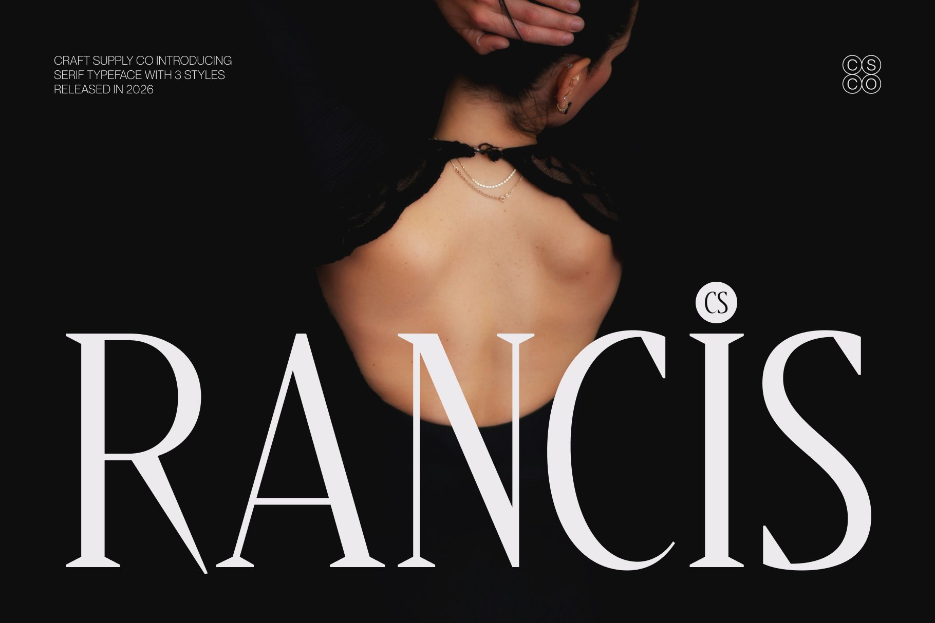
CS Rancis Modern Serif Font offers another direction for designers seeking a polished, contemporary serif style. A modern serif can help a brand establish a recognizable typographic voice without relying on elaborate ornaments or decorative illustrations. Its impact comes from the character of the letterforms and how they interact with spacing, alignment, and surrounding elements.
For an Orchid inspired project, explore CS Rancis in a wordmark concept or an editorial headline. It could work for floral packaging, a beauty campaign, a boutique identity, or a lifestyle brand that needs a sophisticated appearance. Let the typography take the lead and use secondary graphic elements to reinforce the concept rather than compete with it.
4. CS Reba Elegant Serif Font
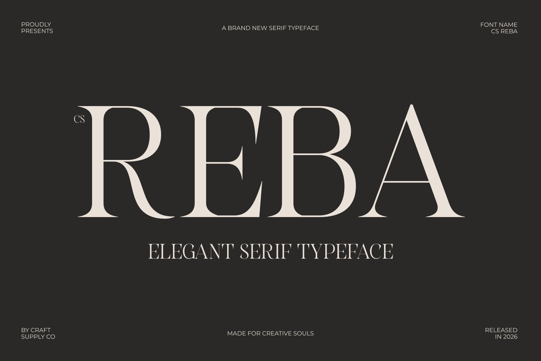
CS Reba Elegant Serif Font is a natural candidate to investigate for branding that emphasizes refinement and visual grace. Elegant serif typography can create a premium impression through carefully considered letterforms, balanced spacing, and an understated presence. This approach can work especially well for florists, beauty products, wedding services, fragrance labels, and boutique lifestyle businesses.
In an Orchid inspired identity, CS Reba could be used for a primary wordmark, packaging titles, or a short brand statement. Pair it with a minimal botanical illustration or a simple floral emblem to connect the typography with the natural inspiration behind the name. A palette of warm ivory, muted green, dusty rose, or deep burgundy may help establish the desired atmosphere.
5. CS Bilbao Modern Serif Font

CS Bilbao Modern Serif Font is an alternative to explore for a brand that needs a contemporary and confident typographic identity. Modern serif styles can help bridge the gap between classic elegance and current visual trends, making them suitable for projects that need both personality and professionalism.
For an Orchid inspired brand, consider CS Bilbao for editorial layouts, collection names, product packaging, or promotional headlines. A strong serif wordmark can become the anchor of the identity while supporting elements introduce the brand’s floral or lifestyle character. Photography, color, and illustration can then change across campaigns without losing the consistency established by the typography.
6. CS Beguile Modern Serif Font
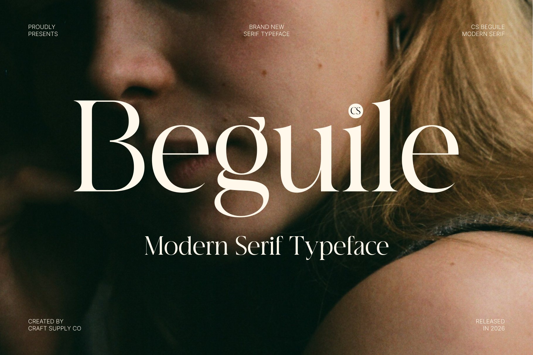
CS Beguile Modern Serif Font is worth exploring when you want a distinctive serif direction with a contemporary feel. The appeal of modern serif typography often lies in the details: the shape of individual characters, the contrast between strokes, and the overall rhythm of a word. These characteristics can help a brand feel more considered and recognizable.
For a brand inspired by Orchid, test CS Beguile in a primary logo concept and a series of supporting headlines. It could suit a beauty label, floral studio, fashion project, or creative business that wants to communicate elegance through typography. Keep the composition simple enough for the lettering to remain the focal point.
7. CS Beffalo Elegant Serif Font
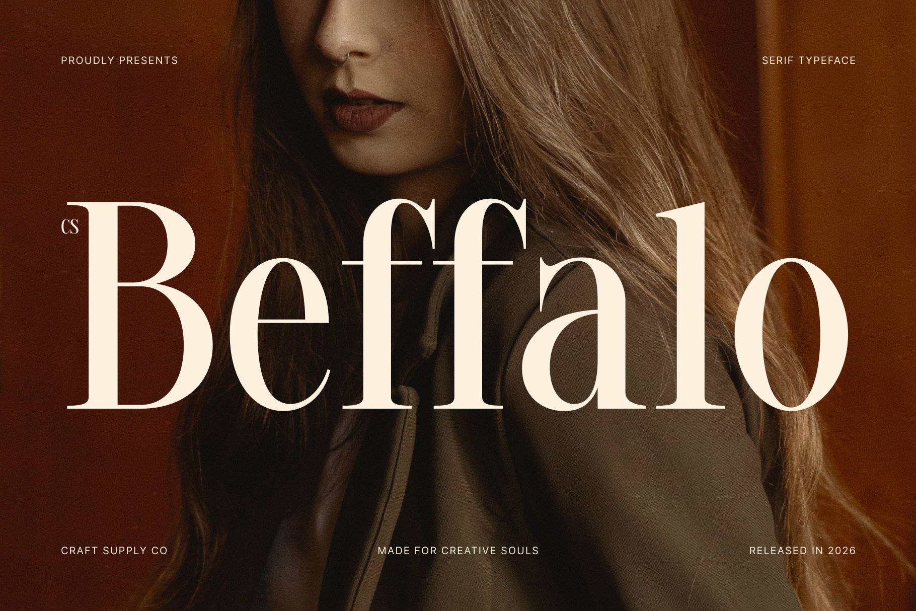
CS Beffalo Elegant Serif Font is another option for projects that aim to create a refined, expressive visual identity. Elegant serif typography can lend a sense of occasion to a brand, making it useful for premium packaging, boutique services, editorial campaigns, and products where presentation contributes to the overall experience.
For an Orchid inspired concept, consider CS Beffalo for the main brand name, a collection title, or a short statement printed on packaging. Combine the font with subtle line art, a restrained palette, and carefully controlled spacing. These elements can communicate sophistication without relying on excessive decoration.
8. CS Arzen Modern Serif Font

CS Arzen Modern Serif Font provides another potential direction for designers who want to combine contemporary styling with the character of serif lettering. A modern serif can offer a recognizable personality while remaining flexible enough for a variety of branding applications, depending on its available styles and proportions.
For an Orchid inspired identity, explore CS Arzen in a logo, a website heading, or an editorial cover. The font can help establish the tone of the brand before the audience reads the supporting message. Use color and graphic elements to reinforce the intended personality, whether you want the identity to feel natural, luxurious, artistic, or minimalist.
9. CS Bellara Modern Serif Font
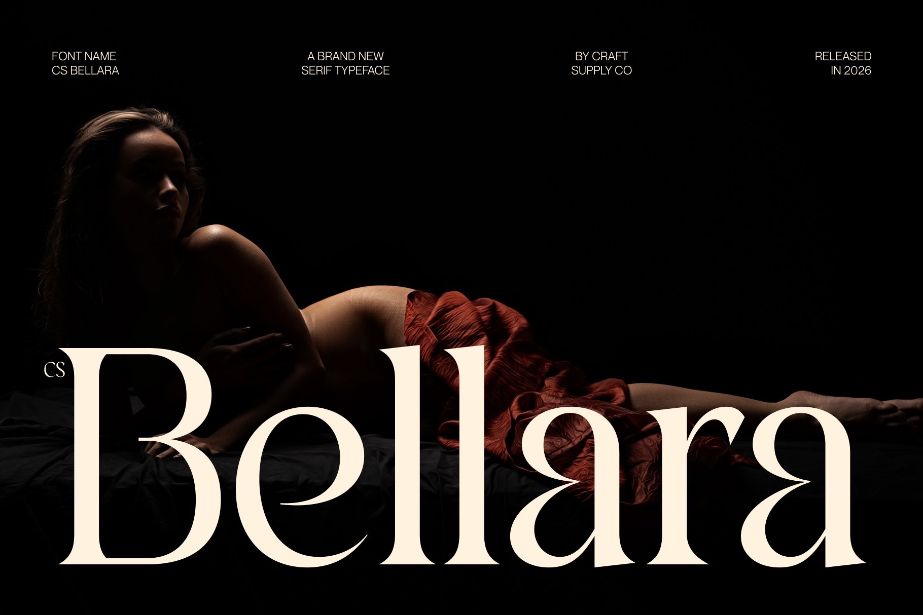
CS Bellara Modern Serif Font is worth considering for a visual identity that needs a polished and contemporary typographic foundation. Modern serif styles can help create an elegant impression without requiring ornamental graphics or elaborate layouts. This makes them useful for brands that want to communicate quality through a more restrained visual language.
For a project inspired by Orchid, try CS Bellara in a wordmark paired with a simple floral symbol or botanical illustration. The typography can provide the main point of recognition while the supporting graphics communicate the natural theme. This relationship works particularly well when the identity needs to remain adaptable across packaging, stationery, digital content, and promotional campaigns.
10. CS Bevoir Modern Serif Font

CS Bevoir Modern Serif Font completes this selection with another option for exploring a contemporary serif identity. When comparing fonts, focus on the overall character of the lettering and how it supports the brand’s purpose. Subtle differences in proportions, stroke contrast, and spacing can change the way an identity feels, even when two fonts belong to the same broad category.
For an Orchid inspired project, consider CS Bevoir for a primary headline, a logo concept, or a collection title. It may also be useful for editorial applications where typography needs to create a clear focal point. Build the surrounding composition with a deliberate hierarchy, keeping supporting information simple and leaving enough negative space around the main text.
How to Choose the Best Orchid Font Alternative
Choosing a typeface is not only about finding the most attractive letterforms. It is about selecting a font that works with the brand’s audience, visual direction, and practical requirements. A serif that looks beautiful on a large poster may need adjustments when used on a small product label or a mobile website.
Define the Brand’s Personality
Start by describing the identity in a few words. Do you want Orchid to feel luxurious, natural, modern, romantic, or artistic? These qualities can guide your shortlist. An elegant serif may support a refined beauty brand, while a condensed serif can create a more editorial and fashion oriented impression.
Test the Full Brand Name
Always evaluate the complete wordmark rather than selecting a font from a single letter. Different character combinations affect the width, rhythm, and overall silhouette of a name. Test the typography in the formats you plan to use, including packaging, websites, labels, and social media graphics.
Pair Display Typography with Readable Text
A distinctive serif often works best for logos and headlines, while a neutral sans serif can handle longer paragraphs and functional information. This pairing creates contrast and helps audiences distinguish the most important messages from supporting details. Keep the typography system simple enough to maintain across future design work.
Use Color and Spacing Intentionally
Color can change the impression created by a typeface. Warm neutrals may reinforce an understated and natural direction, while darker tones can make the identity feel more dramatic. Generous spacing can emphasize elegance, but the final result should still remain readable at the intended size.
Review Licensing and Technical Requirements
Before using a font in a commercial project, check its licensing terms, language support, available styles, and file formats. Confirm that the license covers your intended use, whether that includes a logo, packaging, website, or promotional materials. Practical testing helps ensure that your chosen font works beyond the initial design concept.
Creating a Cohesive Orchid Inspired Visual Identity
A successful identity depends on more than typography. Color, photography, illustration, materials, and layout all influence how an audience experiences the brand. For an Orchid inspired direction, start with a clear visual concept and use each design element to reinforce it.
For example, a floral brand could combine a modern serif wordmark with botanical line art and soft, natural colors. A premium beauty identity might use an elegant serif, minimal packaging, and carefully composed product photography. A fashion oriented concept could use a condensed serif, high contrast imagery, and editorial layouts to create a more dramatic presence.
Choose a consistent set of visual rules and apply them across the brand’s touchpoints. The logo should work alongside packaging, website headings, stationery, and promotional materials without losing its character. A carefully selected typeface gives the identity a recognizable foundation, while other visual elements provide flexibility for different campaigns.
For additional inspiration, explore the typography and branding projects by Craft Supply Co.. Observe how typefaces interact with imagery, spacing, and color, then use those ideas to develop a visual direction that suits your own project.