
A mix condensed font can bring a distinctive look to branding, posters, editorial layouts, packaging, and digital graphics. Condensed typography uses narrower letterforms to make text feel compact, impactful, and easy to arrange in limited spaces. When combined with expressive display styles, mixed font designs can create visual contrast while keeping a composition engaging.
Whether you are designing a fashion campaign, creating a music poster, building a brand identity, or experimenting with social media graphics, choosing the right mix condensed font style can help your work stand out. The key is to balance personality with readability, especially when combining decorative lettering with supporting text.
In this guide, we explore what a mix condensed font can mean in design, how to choose the right style, and 10 creative font alternatives from Craft Supply Co that you can consider for your next project.
What Is a Mix Condensed Font?
The phrase mix condensed font can describe a condensed typeface used alongside another font style or a display font that combines distinctive visual characteristics. Condensed lettering takes up less horizontal space than many standard-width typefaces, making it useful for headlines, short statements, and layouts that need strong typography without occupying too much room.
The word “mix” can also refer to experimenting with different typographic personalities. For example, you might pair narrow, bold lettering with a flowing script, a clean sans serif, or an expressive decorative font. This approach creates contrast and helps readers distinguish headlines from supporting information.
Designers often use condensed typography in fashion editorials, sports graphics, music artwork, event posters, product packaging, and contemporary brand identities. Its compact proportions can make short phrases feel energetic, modern, or dramatic.
Why Use Condensed and Mixed Font Styles?
1. Create Strong Visual Hierarchy
Condensed display lettering helps headlines stand out without requiring a large amount of horizontal space. Pairing it with a simpler supporting typeface creates a clear hierarchy between titles, subtitles, and body copy.
2. Make Better Use of Limited Space
Narrow lettering can fit longer words into compact layouts. This makes it practical for packaging labels, magazine covers, promotional banners, and social media graphics where every part of the composition matters.
3. Add Personality to Your Design
Different font styles communicate different moods. Combining a condensed headline with a decorative or unconventional display font can create a look that feels playful, editorial, industrial, or experimental, depending on the styles you choose.
4. Build Memorable Branding
Distinctive typography can help a brand develop a recognizable visual identity. A consistent combination of headline and supporting fonts gives packaging, advertisements, websites, and printed materials a more unified appearance.
10 Mix Condensed Font Alternatives to Explore
If you are searching for a mix condensed font or an expressive display typeface, these 10 options from Craft Supply Co offer different creative directions to consider. Review each font’s visual character and test it in your intended layout before making a final choice.
1. CS Richard Mix

CS Richard Mix is worth exploring when you want typography with a distinctive display presence. Consider using it for campaign headlines, editorial titles, or short promotional phrases that need to attract attention. If you plan to combine it with a condensed typeface, use the second font for supporting information and keep the headline as the primary visual element.
This approach works well when you want the typography to contribute to a brand’s personality without overwhelming the rest of the layout. Test the font at several sizes to see how its character translates across print and digital formats.
2. CS Spencer Mix

CS Spencer Mix is another option to consider for display led design projects. It can be explored for poster titles, creative branding, magazine inspired graphics, and short statements where typography plays a central role.
For a balanced font combination, pair expressive display lettering with a neutral sans serif for captions, descriptions, and practical details. The contrast can help readers understand the content quickly while preserving the visual impact of the headline.
3. CS Striker Mix

Consider CS Striker Mix for projects that call for a noticeable typographic statement. Display fonts can help give event posters, merchandise graphics, and promotional artwork a more energetic appearance, particularly when the design relies on a short headline.
To explore a condensed inspired layout, place the main phrase in a compact text area and organize the remaining information into smaller sections. Avoid using several competing display styles at once, one dominant typeface and one complementary font are often enough.
4. CS Resting Mix
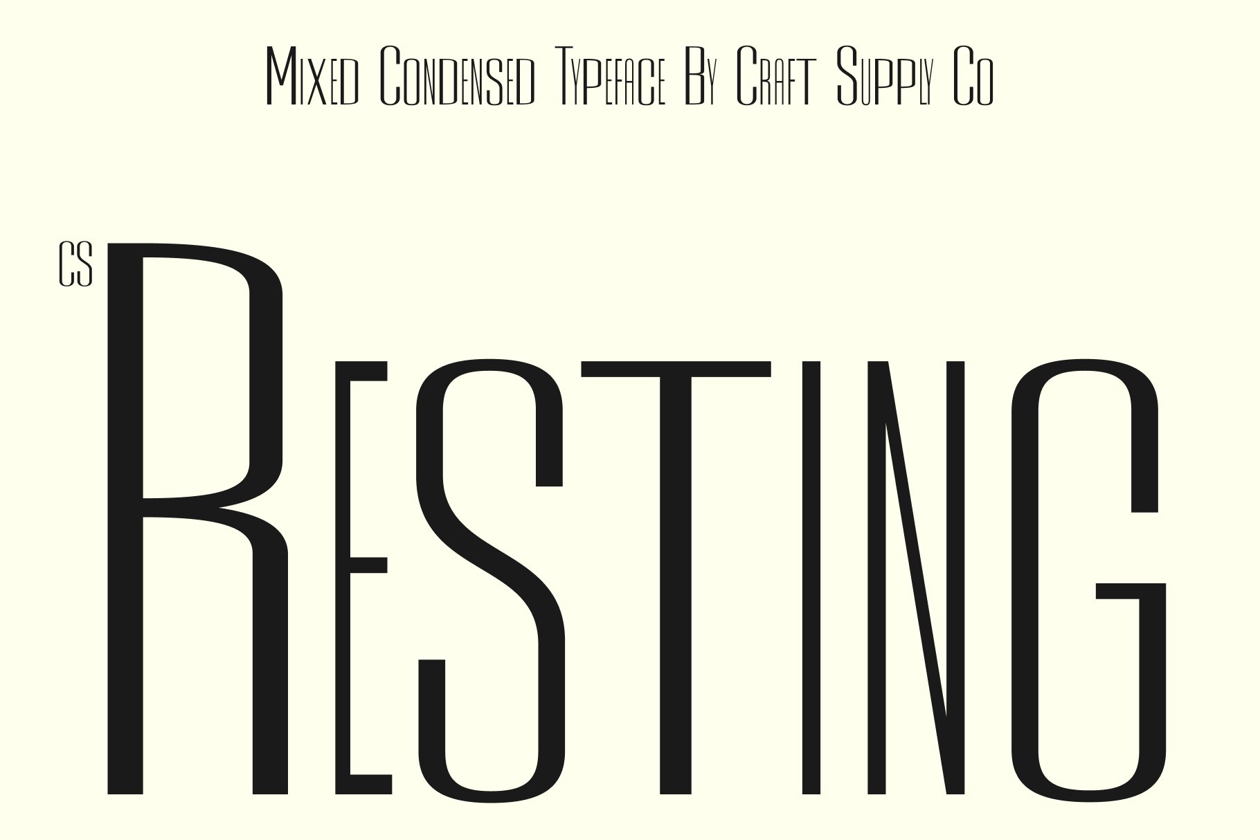
CS Resting Mix offers another direction to investigate when developing a typography led identity. Try it in a brand mood board, editorial title, or social media campaign to see whether its visual personality complements your chosen color palette and imagery.
If the main design already includes complex illustrations or photography, keep the secondary typography simple. A restrained pairing allows the headline to remain prominent and makes the overall composition easier to read.
5. CS Antibes Mix

CS Antibes Mix can be included in your shortlist when you want to explore alternatives for creative branding and display typography. It may be useful to test it across packaging concepts, editorial layouts, and promotional graphics before deciding where it fits best.
For a mix condensed font pairing, focus on contrast in width, weight, and scale. A narrow headline alongside a more open supporting typeface can make a design feel structured while giving each text element a clear role.
6. CS Avoid Mix
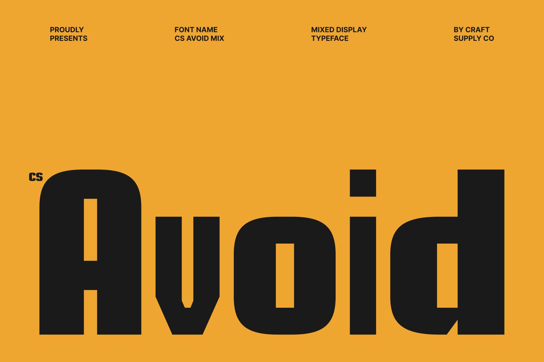
CS Avoid Mix is another candidate for designers experimenting with expressive typography. Consider testing it in a short headline, a campaign title, or a graphic composition where letterforms contribute strongly to the visual concept.
When working with a distinctive display font, keep long paragraphs in a highly readable typeface. This division between decorative headlines and functional body text helps maintain accessibility and prevents the design from feeling crowded.
7. CS Maiden Mix
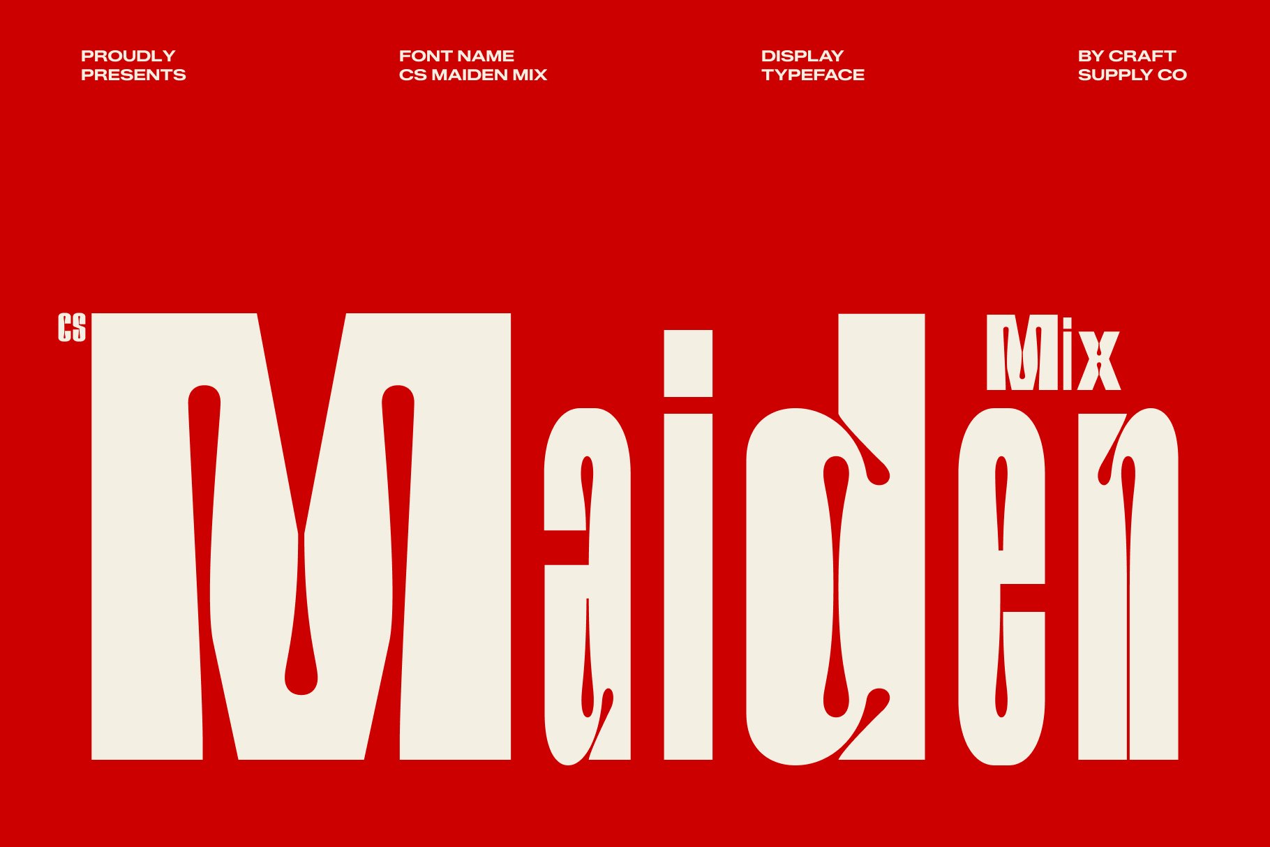
CS Maiden Mix is worth considering for projects that need a different typographic voice. Explore it in visual identity sketches, creative posters, or packaging layouts, then compare how it performs beside a narrow sans serif or another simple text style.
Look at the relationship between letter shapes, spacing, and overall tone. The strongest font combinations do not need to look identical; they need to complement each other and support the purpose of the design.
8. CS Wisdom Mix
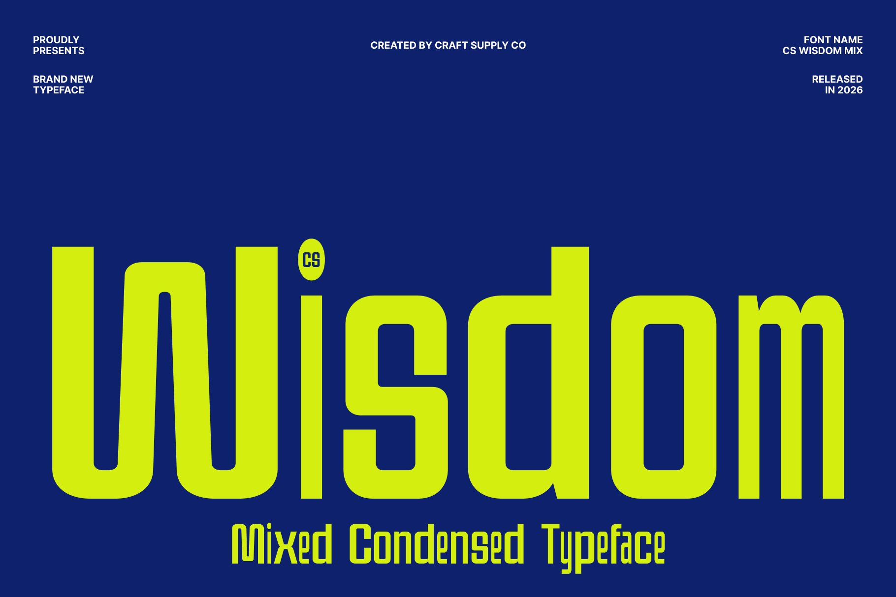
CS Wisdom Mix provides another alternative to test during the font selection process. Use sample words and realistic headlines to evaluate its suitability for your project instead of relying only on the appearance of a font preview.
For a more organized layout, establish a consistent typographic system: one style for the main headline, another for subheadings, and a readable font for body copy. This system helps your design remain consistent across different formats and applications.
9. Demine Mix

Demine Mix is an option to explore for display focused projects that depend on typography to communicate their visual identity. Test it in a few different contexts, such as a poster, a brand title, or a social media graphic, to determine how well it fits your creative direction.
If you combine it with a condensed typeface, pay attention to the balance between the two fonts. Contrasting proportions can be effective, but the text should still feel like part of the same design rather than two unrelated elements.
10. CS Astrophel Mix

CS Astrophel Mix is another font alternative to consider when experimenting with distinctive display typography. Explore it in branding concepts, editorial headlines, promotional posters, or social media graphics to see how its visual character complements your design direction.
For a mix condensed font combination, try pairing CS Astrophel Mix with a narrow, readable typeface for supporting information. Compare different sizes, spacing, and layouts to create a clear visual hierarchy while keeping the overall design cohesive.
How to Choose the Right Condensed Font Combination
Start With the Purpose of Your Design
Identify where the typography will appear before selecting fonts. A large event poster can accommodate expressive display lettering, while a website interface or product label may require more attention to legibility. Choose a style that supports the message rather than selecting a font based on appearance alone.
Combine Different Typographic Roles
A useful starting point is to assign one font to headlines and another to supporting copy. Condensed lettering can make the headline compact and prominent, while a neutral sans serif can make descriptions, captions, and navigation easier to read. If you want a more expressive design, introduce a decorative style selectively.
Balance Width, Weight, and Personality
Font combinations work best when the styles have enough contrast to feel distinct but share a compatible visual mood. Pairing two highly decorative typefaces can create competition, while combining a distinctive display font with a restrained supporting font often produces a clearer result.
Check Readability at Different Sizes
A font that looks excellent in a large headline may become difficult to read in small text. Preview your combination on desktop screens, mobile devices, printed materials, and packaging mockups when relevant. Adjust spacing and line breaks as needed, and avoid compressing text excessively just to fit a narrow space.
Keep the Design Consistent
Once you have selected a combination, define where each font should appear. Use the same headline style across campaign graphics, reserve the supporting font for explanatory text, and establish consistent sizing and spacing rules. This creates a recognizable system that can grow with your brand.
For more creative direction, explore the portfolio of Craft Supply Co to see how typography can contribute to a broader visual identity. Collect references that match your intended mood, then test your font choices in your own layouts.
Common Mistakes to Avoid When Mixing Condensed Fonts
Using too many fonts can make a composition feel inconsistent, so it is best to start with two complementary typefaces and only add another for a clear purpose. This careful selection must extend to your spacing and layout choices, because condensed lettering already uses a narrow width. Extremely tight tracking can make headlines illegible. Therefore, you should prioritize legibility over pure style by reserving elaborate display typography for short phrases and switching to highly readable typefaces for longer text blocks.
Furthermore, always ensure your typography actively supports the brand’s personality and intended tone. For instance, bold and experimental pairings work perfectly for creative campaigns, whereas restrained combinations are better suited for professional services. Ultimately, by evaluating your target audience, industry standards, and message before making a selection, you can avoid a chaotic layout and build a visually balanced system.
Where Can You Use Mix Condensed Font Styles?
- Brand identity: Create memorable wordmarks, campaign headlines, and supporting brand graphics.
- Posters and event graphics: Make key phrases stand out in limited space.
- Editorial layouts: Establish contrast between article titles, subheadings, captions, and body text.
- Packaging: Give product names a strong visual presence while keeping essential details legible.
- Social media: Build clear, attention-grabbing headlines for posts, stories, and promotional graphics.
- Merchandise: Experiment with short phrases and expressive typography on apparel and printed products.
Before using a font commercially, review its license and confirm that the permitted uses match your project. Licensing terms may differ depending on whether you are creating a logo, a website, merchandise, or other commercial materials.
Finding the right mix condensed font is about more than choosing narrow lettering. It means creating a purposeful relationship between typography, layout, and message. A condensed headline can save space and establish hierarchy. While a complementary display or text font adds contrast and helps the design communicate its personality.
Explore the 10 font alternatives above, test them in realistic layouts, and compare how each option works with your imagery and supporting typography. Remember that the best combination is not necessarily the most complicated one. It is the pairing that communicates clearly, suits your visual direction, and remains consistent across applications. For more typography inspiration and creative resources, visit Craft Supply Co and continue experimenting with font combinations that fit your next design project.