
Choosing what 2 fonts go well together is one of the most important decisions in graphic design. The right font pairing combination can make a brand feel professional, help a website become easier to navigate, and give a poster or social media graphic a stronger visual identity. However, combining two typefaces is not simply about choosing fonts that look attractive individually. They also need to complement each other, create a clear hierarchy, and support the message of the design.
A successful font pairing often combines contrast with consistency. For example, a decorative display font can work beautifully with a simple supporting typeface, while two complementary styles from a font duo can create a coordinated visual identity. The key is to give each font a distinct role without making the overall design feel disconnected.
In this guide, we explore 10 creative font pairing options from Craft Supply Co and explain how to approach font pairing with them. Whether you are designing a logo, website, invitation, packaging, or promotional graphic, these ideas can help you build a more cohesive typographic system.
What Makes Two Fonts Go Well Together?
Two fonts work well together when they create a balance between contrast, readability, and visual consistency. They do not need to look identical. In fact, font pairing with different characteristics often produce more interesting results when each one has a clear purpose.
A display font might communicate personality through unusual shapes, decorative details, or expressive lettering. A supporting font can provide clarity for descriptions, captions, and longer text. This relationship allows the main message to stand out while keeping the overall composition organized. For more typography ideas and creative design references, explore Craft Supply Co on Behance.
When choosing font combinations, consider the following principles:
-
- Contrast: Combine noticeably different styles, such as expressive display lettering with a simple, readable typeface.
- Hierarchy: Give the headline and supporting text different roles through size, weight, and placement.
- Consistency: Choose fonts that support the same brand personality, even when their visual styles differ.
- Readability: Keep body text clear, particularly for websites, articles, and information heavy designs.
- Purpose: Select combinations that suit the project, whether it involves editorial design, branding, packaging, or social media.
10 Font Pairing Options to Inspire Creative Pairings
1. CS Windsey Font Duo

A font pairing is a useful starting point when you want two complementary styles that are intended to work together. CS Windsey Font Duo offers a convenient option to explore for designs that need coordinated typography. Rather than building a pairing entirely from scratch, you can investigate the included styles and decide how each one can support a different role in your layout.
Consider using this font duo for branding, invitations, packaging, and social media graphics. You might use the more expressive style for a headline or brand name and the complementary style for secondary information, depending on the available fonts. Keep the hierarchy clear and test both styles together before applying them across a complete design system.
2. CS Solyne Font Duo

CS Solyne Font Duo is another option for designers who want a coordinated typographic starting point. Font duos can simplify the process of finding two styles that share a compatible design direction. They can also help create consistency across projects that require both attention grabbing headlines and supporting text.
Explore this duo for boutique branding, stationery, promotional graphics, and product packaging. Assign one style to the primary message and use the other for supporting details where appropriate. To avoid a cluttered result, limit additional decorative elements and let the font combination establish the visual personality.
3. CS Sharel Font Duo

CS Sharel Font Duo offers another possible solution for building a cohesive typographic identity. A coordinated duo can be particularly useful when you need to repeat a consistent visual style across different applications, from a logo and business card to a website and social media campaign.
Try this option for creative businesses, event materials, packaging, or editorial graphics. Use the more prominent style for titles and reserve its companion for secondary elements, depending on the characteristics of the included fonts. Adjust size, spacing, and placement to make the relationship between the two styles easy to understand.
4. CS Ritsa Font Duo
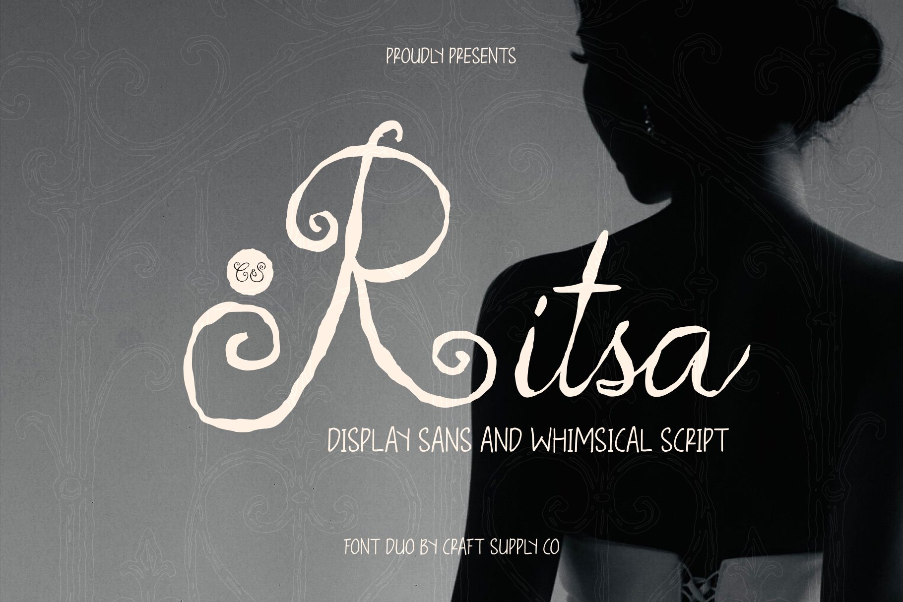
CS Ritsa Font Duo is worth exploring when you want a ready made combination to inspire your next project. Using a font duo can reduce the guesswork involved in choosing complementary typography, particularly when you are building a visual identity from the beginning.
Consider using it for invitations, branding, product labels, social media templates, and promotional materials. Before deciding how to apply the fonts, examine their individual characteristics and test different combinations of headline and supporting text. A successful pairing should create a recognizable hierarchy while keeping every important message easy to read.
5. CS Andie Trippy Font

CS Andie Trippy Font provides a more experimental direction for designers who want expressive display typography. Fonts with unusual or unconventional visual treatments can give a headline a strong personality, making them useful for projects that need to feel creative rather than conventional.
When pairing this font, consider contrasting its distinctive appearance with a clean sans serif typeface for the supporting text. This approach can help maintain readability while allowing the display lettering to attract attention. Explore it for posters, music inspired graphics, creative campaigns, and social media artwork where an experimental visual identity makes sense.
6. Raftwork Rounded Font
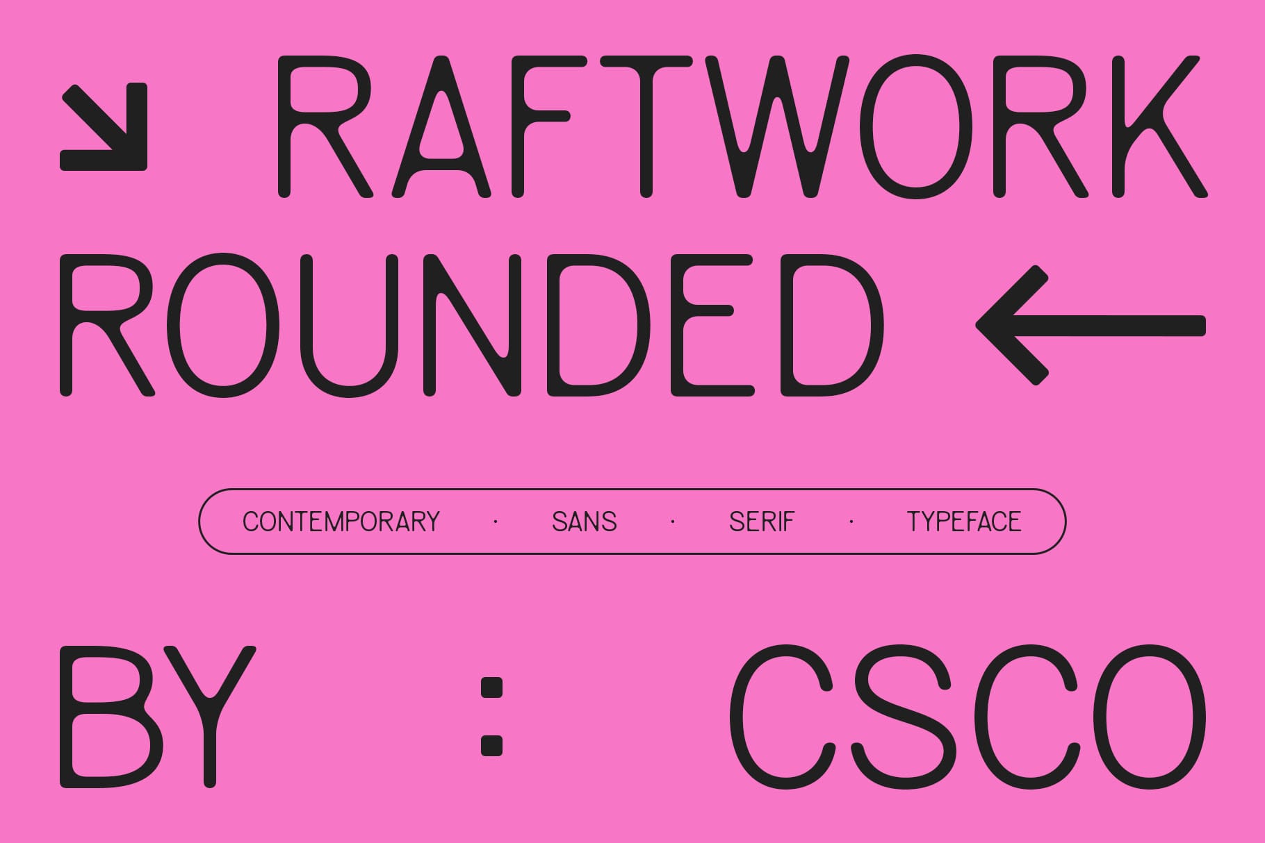
Rounded typography can introduce a friendly and approachable character to a design. Raftwork Rounded Font is an option to explore when you want a softer visual direction instead of sharp, highly formal lettering. Rounded styles can be useful for brands and projects that prioritize accessibility, playfulness, or a contemporary casual atmosphere.
For a balanced pairing, try combining it with a simple sans serif font that has a different structure but a compatible personality. Use the rounded font for headings or short statements and the supporting font for descriptions and practical details. This combination can work well for lifestyle branding, packaging, digital graphics, and creative presentations.
7. Qalited Industrial Font

Qalited Industrial Font offers a direction for designs that call for a stronger, more industrial visual character. A distinctive display font can help establish the mood of a project, especially when the typography is intended to become a central part of the composition.
To create contrast, consider pairing it with a neutral sans serif typeface for supporting copy. The industrial style can carry the main headline, while the simpler font keeps specifications, captions, or descriptions readable. This approach is worth exploring for posters, merchandise, product graphics, and branding that benefits from a bold visual direction.
8. CS Aslan Rippled
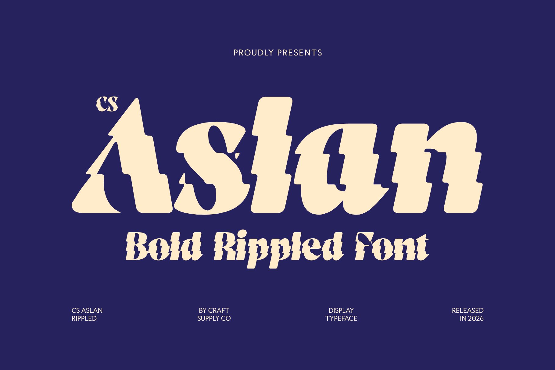
CS Aslan Rippled is an option to consider when you want to explore a more distinctive display treatment. Fonts with unusual visual effects can introduce movement and visual interest, helping a headline become a focal point within a design. They are generally most effective when the rest of the typography provides enough contrast to keep the composition balanced.
Consider pairing this font with a clean, understated typeface for secondary text. Use the expressive style selectively for short headlines, campaign titles, or key phrases, and keep longer information in a more readable font. This can help create a visually engaging result without allowing decorative typography to overwhelm the message.
9. CS Harley Mix

CS Harley Mix is another option to investigate for designs that need a distinctive typographic identity. When working with an expressive font, it helps to establish a clear relationship between the primary lettering and its supporting typeface. This ensures that the overall design feels intentional rather than like a collection of unrelated styles.
Explore this option for creative branding, posters, packaging, and promotional graphics. Choose a complementary font that supports the project’s tone and provides clear supporting information. If the primary style is visually complex, a simpler companion can help the layout remain organized and easy to navigate.
10. CS Champion Refracted

CS Champion Refracted is worth exploring for projects that call for expressive, attention grabbing typography. A distinctive display font can help communicate a creative direction quickly, especially in designs where a headline or short phrase needs to dominate the visual hierarchy.
For a practical pairing, combine it with a straightforward font for supporting text. This contrast can make the primary message more noticeable while preserving clarity throughout the composition. Consider testing it in posters, event graphics, merchandise, and digital campaigns, adjusting the scale and spacing until both typefaces work together effectively.
5 Practical Rules for Pairing Two Fonts
1. Combine Different Font Categories
One of the simplest ways to create contrast is to combine different font categories. For example, a decorative display font can work with a neutral sans serif, or a classic serif can complement a simple sans serif. The difference between the styles gives each font a clear role and helps readers understand the structure of the design.
2. Limit Your Design to Two Main Fonts
Using two main fonts can help a layout feel consistent and organized. One font can handle the headline, while the other supports paragraphs, captions, or labels. You can still create variety through size, weight, spacing, and color without introducing unnecessary typefaces.
3. Match the Fonts to Your Brand Personality
Consider what your design needs to communicate. A playful brand may benefit from rounded or expressive typography, while an editorial project may call for more restrained lettering. Both fonts should contribute to the same overall direction, even when they provide visual contrast.
4. Check Readability at Different Sizes
Font combinations should work in their intended environment. A display style may look excellent on a large poster but become difficult to recognize when reduced to a small mobile heading. Test both fonts at realistic sizes and make sure the supporting typeface remains comfortable to read.
5. Test the Pairing in a Real Layout
Do not judge a combination only by viewing the fonts separately. Write a sample headline, add supporting text, and place both within a realistic composition. This helps you evaluate spacing, contrast, visual hierarchy, and whether the fonts genuinely complement each other.
Common Font Pairing Mistakes to Avoid
One common mistake is choosing two fonts that compete for attention. If both styles contain elaborate details or unusual shapes, the design may feel crowded. Instead, allow one font to become the primary visual feature and let the other support it.
Another mistake is choosing fonts that look too similar without creating a meaningful distinction. Two nearly identical styles may not establish a clear hierarchy, especially in headings and supporting text. Look for a useful contrast in structure, weight, or personality while keeping the overall design coherent.
It is also important to consider spacing and proportion. Even well chosen fonts can look disconnected if their sizes, line heights, and alignment are inconsistent. Review the complete composition and adjust these details to make the pairing feel intentional.
For additional typography inspiration and creative design references, visit Craft Supply Co on Behance. Experiment with different styles, keep readability in mind, and build font combinations that express the personality of your next project.