
Some brands stand out because they take a different approach to visual identity. Instead of relying on formal typography and predictable layouts, they use playful lettering, expressive shapes, and a distinctive personality to make their designs memorable. Cool Cat’s typography is an interesting starting point for exploring this creative direction, especially for designers who want to understand how playful typography can help a brand communicate its character.
Whether you are developing a logo, designing packaging, creating merchandise, or building a social media identity, choosing the right Cool Cat’s typography can make a significant difference. A playful typeface can make a brand feel approachable, youthful, imaginative, or slightly unconventional. The challenge is finding a font that delivers personality without making the design difficult to read.
In this guide, we explore the ideas behind a Cool Cat’s typography inspired visual direction and introduce ten playful font alternatives from Craft Supply Co. Each option offers a different way to bring character into your next creative project.
Understanding Cool Cat’s and Its Creative Appeal
The name Cool Cat’s evokes a relaxed, confident, and playful personality. The word “cool” suggests individuality and effortless style, while “cat” can bring to mind curiosity, independence, and a little mischief. Together, these associations offer plenty of inspiration for a brand identity that feels friendly without becoming overly childish.
Cool Cat’s typography can help translate these qualities into a recognizable visual language. Rounded letterforms may communicate friendliness, handwritten styles can introduce a personal touch, and bold display fonts can make a name stand out across packaging or promotional materials. Even small differences in letter shapes, spacing, and stroke weight can influence how people perceive a brand.
This article uses Cool Cat’s typography as a creative reference for discussing playful branding and typography. The suggestions below are independent font alternatives, not claims about the brand’s official typeface or visual identity.
Why Playful Typography Works for Branding
Playful typography gives designers a way to communicate personality through letterforms. It can make a brand feel less corporate and more expressive, which is useful for businesses that want to connect with audiences through creativity, humor, or a relaxed attitude.
- It creates personality. Distinctive letterforms can make a name feel energetic, friendly, quirky, or imaginative.
- It improves recognition. A memorable display font can help a logo or headline stand out among competing visual messages.
- It supports storytelling. Typography can reinforce a brand’s tone before customers read the supporting copy.
- It adds visual variety. Playful fonts can introduce contrast into layouts that use simple colors, clean grids, or minimal illustrations.
- It works across creative applications. The right font can appear on packaging, merchandise, posters, website headers, and social media graphics.
However, playful typography works best when designers use it with intention. A highly expressive font may look excellent in a logo but become tiring in long paragraphs. For a more versatile identity, use the most distinctive typeface for headlines and combine it with a readable font for supporting information.
10 Playful Fonts Worth Copying for a Cool Cat’s-Inspired Design
1. CS Gracila Playful Font

CS Gracila Playful Font is a great starting point for designers who want to explore a lively, character driven visual identity. A playful display font can help a brand name feel more expressive than it would in a conventional sans serif, making it suitable for logos, product labels, stickers, and promotional graphics.
For a Cool Cat’s inspired direction, consider using CS Gracila as the primary display typeface. Give the brand name enough space to stand out, then support it with simple graphic elements or a restrained color palette. This approach allows the lettering to carry much of the personality without overwhelming the composition. It can also work well for limited edition packaging or social media campaigns that need an upbeat, memorable headline.
2. CS Adelmo Playful Font
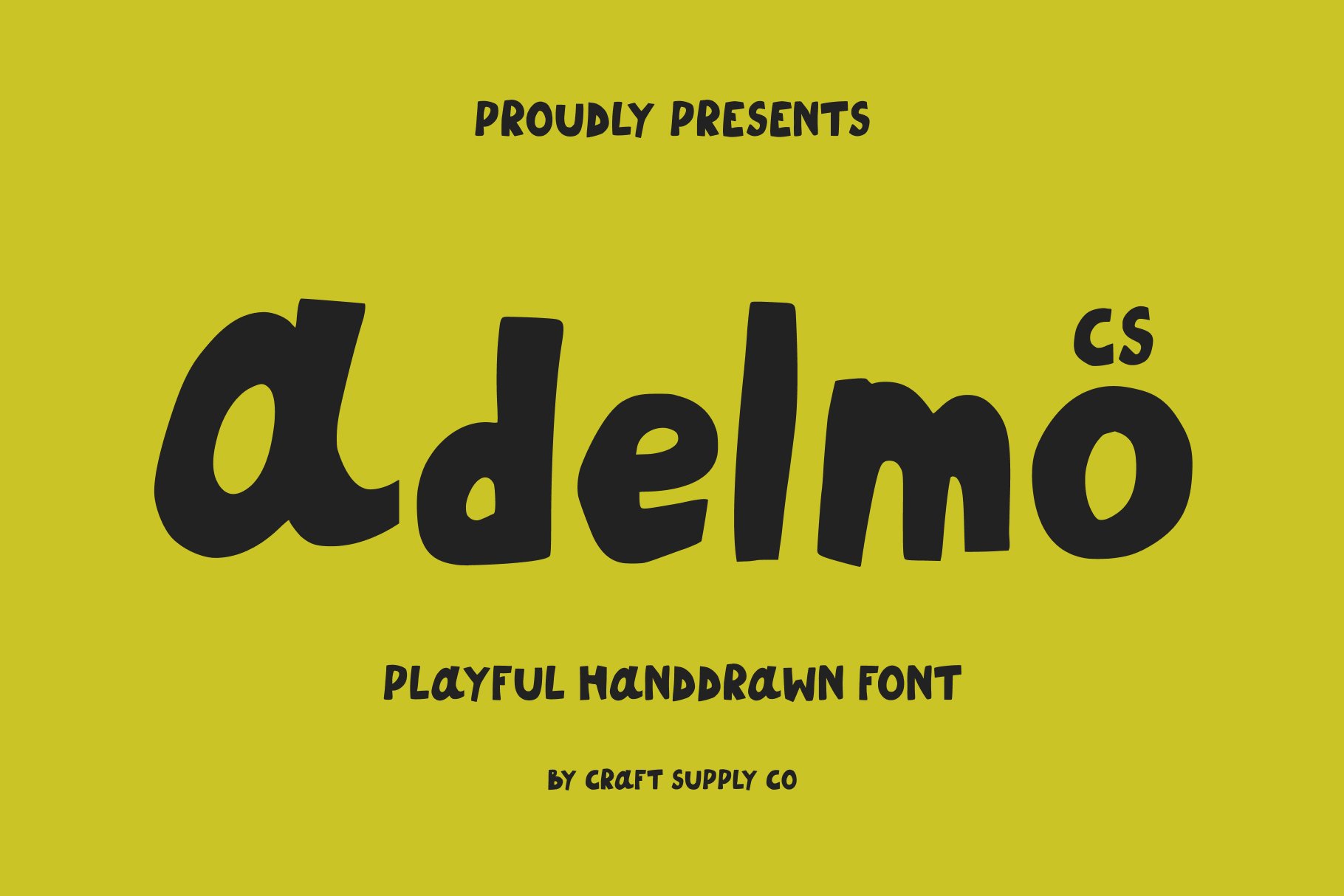
CS Adelmo Playful Font offers another direction for projects that need a more expressive typographic voice. Playful display lettering can make a visual identity feel energetic and distinctive, especially when the surrounding design remains simple. This makes it worth considering for lifestyle brands, creative businesses, merchandise, and promotional materials.
Use CS Adelmo to establish a recognizable headline style for a Cool Cat’s inspired project. A prominent wordmark can sit alongside simple illustrations, colorful shapes, or a clean background. If the design includes several messages, reserve the font for the most important words and use a more neutral typeface for captions and details.
3. CS Maxine Playful Handwritten Font
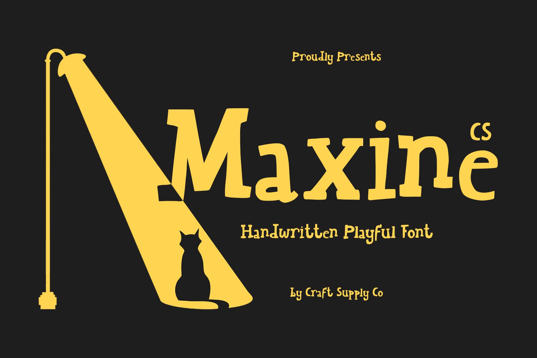
Handwritten typography introduces a personal quality that conventional display fonts may not provide. CS Maxine Playful Handwritten Font is an option to explore when you want a design to feel more informal, expressive, and human. Handwritten styles can suggest spontaneous notes, personal recommendations, or a creative signature.
For a Cool Cat’s inspired identity, consider using CS Maxine in short phrases, promotional messages, packaging accents, or secondary logo treatments. The handwritten appearance can contrast nicely with structured layouts and geometric illustrations. It can also help create a friendly tone for social posts, merchandise, and printed inserts.
4. CS Bilaby Playful Font

CS Bilaby Playful Font is another candidate for a brand that wants a distinctive and approachable personality. Playful lettering can bring energy to a design without requiring elaborate illustrations or complicated visual effects. When the font itself has enough character, a simple layout can become memorable through typography alone.
Explore CS Bilaby for a logo concept, a product title, or a series of short campaign headlines. A Cool Cat’s inspired design could use the font for its primary name while keeping the rest of the layout uncluttered. Consider combining the typography with a small cat illustration, a simple icon, or a repeated graphic motif to establish a consistent visual language.
5. CS Rolisy Playful Font
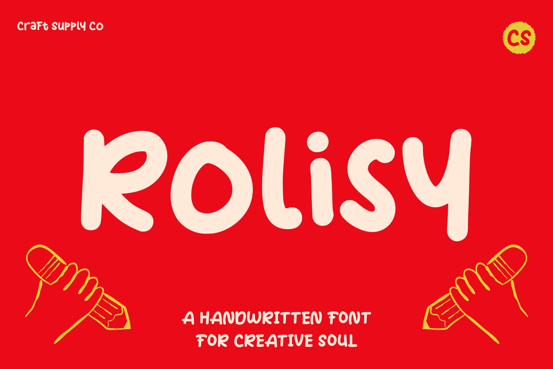
CS Rolisy Playful Font is worth exploring when a project calls for a more relaxed and creative display style. Playful fonts can help a brand communicate a sense of fun while giving headlines and short messages a distinctive visual rhythm. They are especially useful for projects that depend on personality rather than a strictly formal appearance.
Consider using CS Rolisy for a Cool Cat’s inspired wordmark, a product collection title, or promotional artwork. To build a cohesive identity, repeat the same typographic treatment across several applications, including packaging, social media templates, and printed materials. Consistency helps audiences recognize the brand even when the layout or imagery changes.
6. CS Easton Playful Font

CS Easton Playful Font provides another alternative for designers exploring expressive typography. A distinctive display font can help a brand name become the focal point of a layout, particularly when it appears on posters, product labels, banners, or digital graphics. The goal is to create a typographic style that supports the brand’s personality instead of competing with it.
For a Cool Cat’s inspired concept, test CS Easton in a bold headline treatment and then build a supporting layout around it. Keep the most important message prominent, place secondary information nearby, and use negative space to separate the elements. This simple hierarchy can make a playful design feel polished rather than chaotic.
7. CS Carys Playful Display Font

CS Carys Playful Display Font is an option to consider when the design depends on prominent, expressive lettering. Display fonts are intended to attract attention in short text, which makes them particularly useful for brand names, campaign headlines, posters, and product titles. Their visual personality can help a creative project establish a recognizable tone.
Use CS Carys as a headline font in a Cool Cat’s inspired branding concept. It could anchor a wordmark, introduce a product range, or appear in oversized lettering on promotional artwork. When a display font becomes the main visual feature, the surrounding design can remain relatively minimal. A clean background, restrained supporting text, and consistent spacing will allow the typography to stand out.
8. CS Roxby Playful Handwritten Font
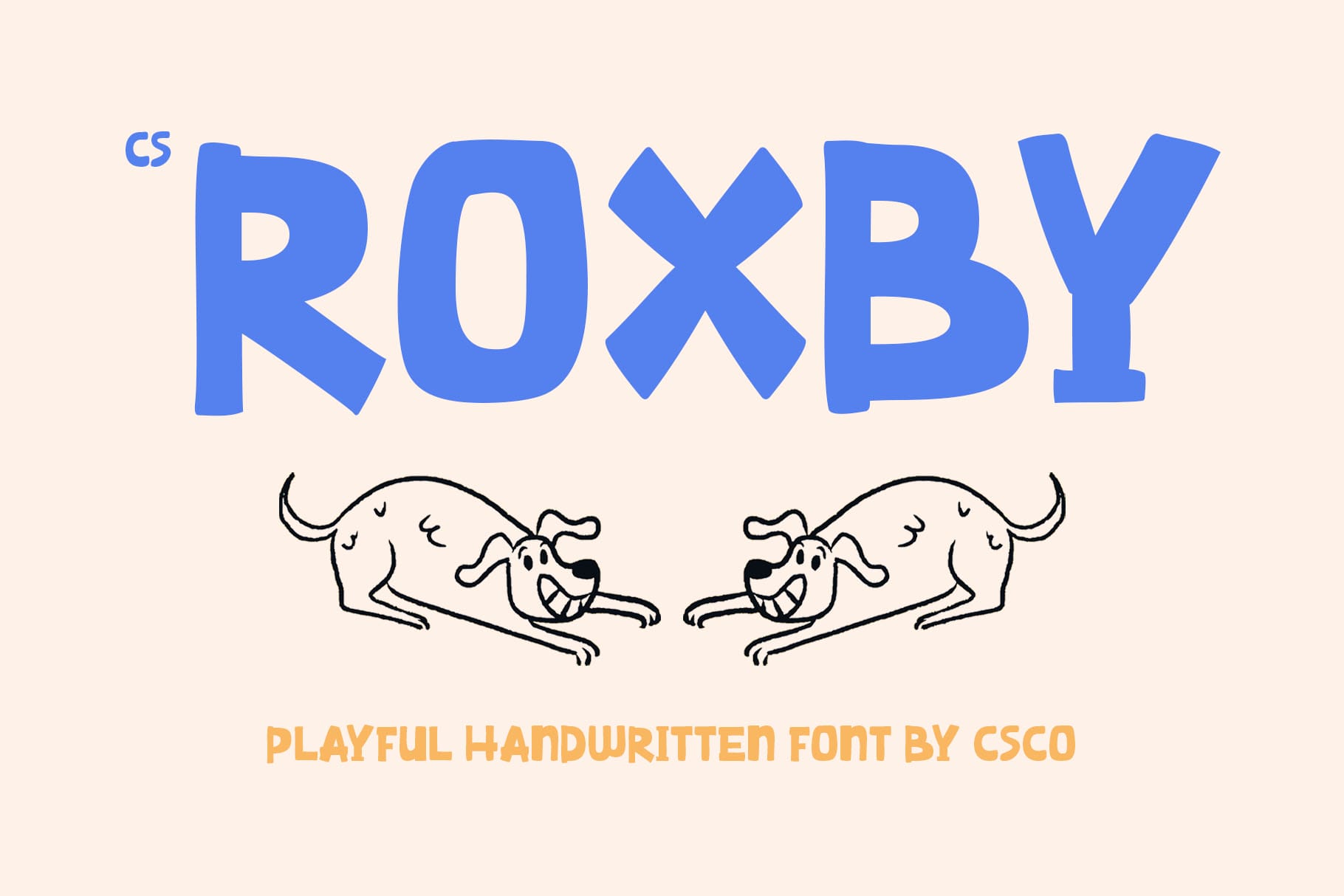
CS Roxby Playful Handwritten Font is worth considering for brands that want to introduce a more personal, informal element into their typography. Handwritten fonts can feel expressive and spontaneous, which makes them useful for creative packaging, casual merchandise, social media content, and short promotional messages.
For a Cool Cat’s inspired project, use CS Roxby for a short tagline or secondary message that complements the primary wordmark. The contrast between handwritten lettering and a more structured display font can create an interesting relationship between different parts of the composition. It can also help make packaging feel more personal without changing the entire visual identity.
9. Kiddosy Playful Display Font

Kiddosy Playful Display Font is an option for projects that need a distinctly playful typographic direction. Fonts with a display focused role can be useful for creative businesses, youth oriented products, event graphics, and merchandise where personality matters as much as information. Their strongest role is usually to attract attention and establish a mood.
For a Cool Cat’s inspired identity, explore Kiddosy in short, prominent phrases. It could work in a logo concept, a headline for a product launch, or a poster featuring playful illustrations. If the design includes a cat character or another mascot, use the typography to complement the illustration rather than duplicating every detail of its style.
10. CS Liston Inktrap Font
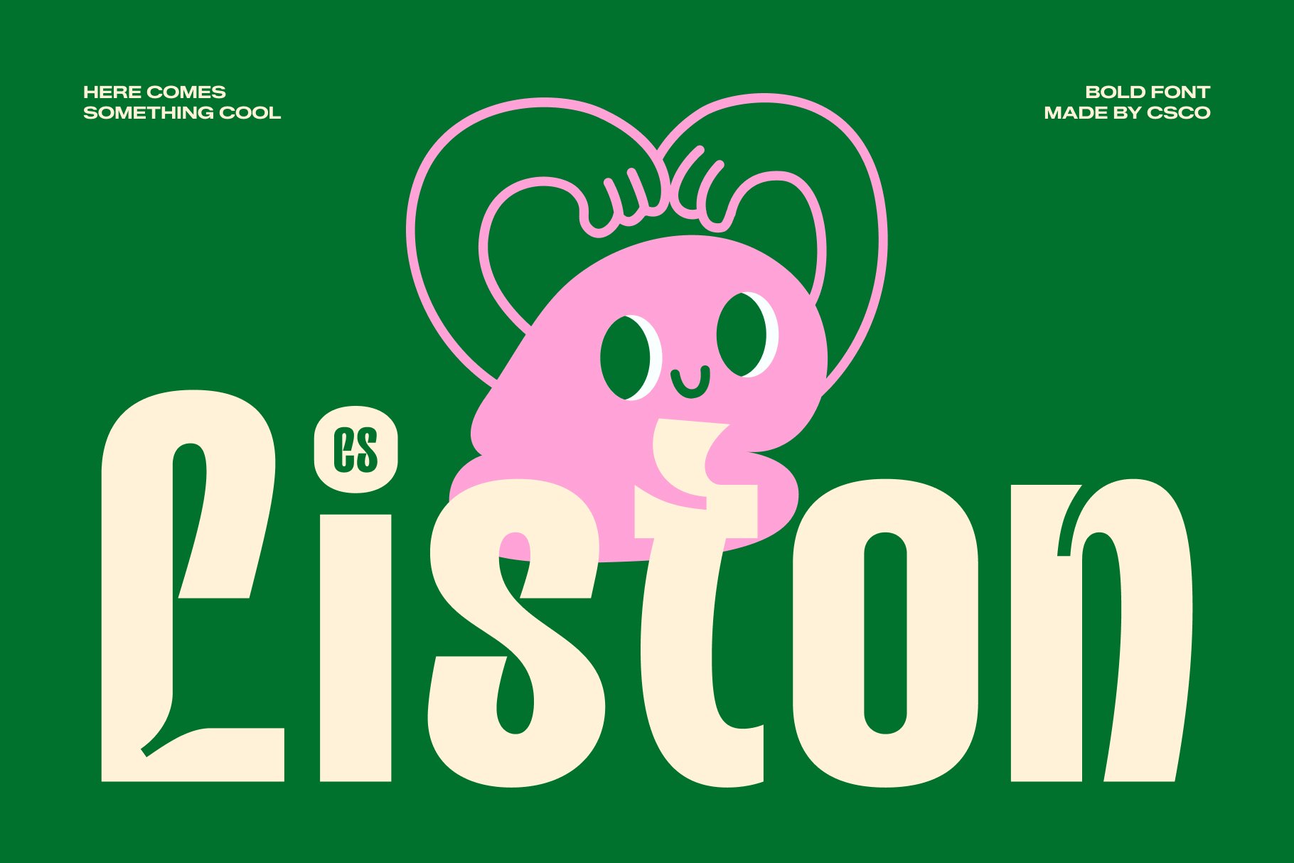
CS Liston Inktrap Font introduces a different typographic direction to this playful selection. Inktrap details are design features often associated with typefaces intended to preserve clarity under particular printing conditions, especially where ink spread can affect small details. They can also become a distinctive visual characteristic that gives lettering an unusual, technical, or editorial quality.
This option can help create contrast in a Cool Cat’s inspired visual identity. Rather than relying entirely on playful lettering, you could use CS Liston Inktrap for selected headlines or supporting graphic elements. The contrast between a more structured typographic style and lively illustrations or colors can create a design that feels unexpected and contemporary.
How to Choose the Best Font for a Cool Cat’s Inspired Brand
With ten Cool Cat’s typography to consider, the best way to make a decision is to test each font against the needs of the project. A font may look appealing in a specimen but behave differently when applied to a complete brand name, a narrow label, or a small digital graphic.
Start with the Brand Personality
Write down three or four words that describe the intended identity. For example, you might want it to feel playful, confident, friendly, and unconventional. Use those qualities to evaluate each font. A handwritten style may emphasize personality, while a display font may create a stronger headline presence. Choose the typeface that supports the intended message rather than simply following a trend.
Test the Actual Brand Name
Different words create different typographic shapes. Letter combinations, repeated characters, and the width of individual letters can change the appearance of a wordmark. Test the full name in each shortlisted font, then compare the results at large and small sizes. Check whether the name remains readable and whether the overall silhouette feels distinctive.
Choose Supporting Typography
A playful display font rarely needs to do every job in a visual identity. Pair it with a simple sans serif for product information, descriptions, website copy, and other functional text. Keep the number of typefaces manageable and establish clear rules for headings, subheadings, captions, and body copy.
Consider Color and Graphic Elements
Cool Cat’s typography works alongside color, illustration, photography, and layout. A bright palette can make a design feel energetic, while a restrained palette may give playful lettering a more sophisticated character. Test the font in several combinations before deciding on a direction. If the letters already have a strong personality, avoid adding too many competing graphic effects.
Check Licensing and Practical Use
Before using any font commercially, review its licensing terms and confirm that it covers your intended applications. Check language support, available characters, file formats, and any restrictions that may affect logos, packaging, websites, or merchandise. Practical considerations are essential when turning a promising font choice into a reliable brand asset.
Building a Playful Visual Identity That Feels Original
Using a Cool Cat’s typography for inspiration does not mean copying an entire visual identity. The strongest branding projects combine typography with original decisions about composition, color, illustration, and messaging. A playful font can provide a starting point, but the final identity should reflect the specific character and goals of the brand.
For a Cool Cat’s inspired direction, experiment with a distinctive wordmark, a simple mascot or graphic motif, and a consistent color palette. Establish a hierarchy that makes the brand name easy to recognize, then use smaller elements to add personality. Repeating a few visual features across packaging, social media, and promotional materials can create a recognizable system without making every design identical.
For further creative inspiration, explore the typography and branding projects featured by Craft Supply Co.. Look at how designers combine letterforms, spacing, colors, and supporting visuals to communicate a specific personality. Use these references to guide your own experiments and develop a visual identity that feels intentional rather than derivative.