
Finding the right font is an important part of creating memorable graphic designs. Whether you are designing a brand identity, an editorial layout, a website, or social media content, typography influences how people perceive your work. Adobe creative applications give designers access to a wide range of typographic possibilities, making font selection an essential part of many creative workflows. If you are searching for an Adobe favorite font, you may be looking for a typeface that combines visual personality, versatility, and practical usability.
There is no single font that works best for every Adobe project. The right choice depends on your creative direction, audience, and design requirements. Some projects benefit from classic editorial serifs, while others need expressive display lettering, rounded sans serifs, or elegant scripts. Exploring alternatives outside your usual font collection can also help you develop a more distinctive visual identity.
In this guide, we explore the characteristics of popular font styles used in creative design and introduce 10 alternatives from Craft Supply Co. These typefaces offer different creative directions to consider when developing your next project in Adobe Illustrator, Photoshop, InDesign, or other design applications.
What Makes an Adobe Favorite Font?
An Adobe favorite font is not necessarily one specific typeface. The phrase can describe a font that a designer regularly chooses when working with Adobe creative software. It might be a dependable serif for editorial layouts, a bold display font for promotional graphics, or a versatile sans serif for digital branding.
Adobe applications support different typographic workflows, including font selection, text formatting, spacing adjustments, and layout customization. Designers can explore available typefaces and choose options that suit their visual goals. A favorite font often becomes part of a designer’s creative toolkit because it consistently supports the kind of work they produce.
However, a useful font should offer more than an attractive appearance. It should also work well in its intended context, remain readable at the required size, and complement the other visual elements in a composition.
What to Look for in a Great Design Font
1. Visual Personality
Every typeface communicates a particular mood. A classic serif can suggest sophistication and tradition, while a rounded sans serif may create a friendlier impression. Script fonts can introduce an expressive or personal quality, and Gothic styles can bring a more dramatic visual direction. Choose a font that supports the personality you want your design to communicate.
2. Readability
Typography should make information easy to understand. A decorative display font may look impressive in a large headline but become difficult to read in a paragraph. Consider the intended size, viewing distance, and amount of text before deciding whether a typeface is appropriate.
3. Versatility
A versatile font can support different applications within a consistent design system. Depending on the available styles and weights, a typeface family may provide options for headlines, subheadings, and supporting text. Reviewing the font family and its available styles helps you understand how much flexibility it offers.
4. Compatibility With Your Creative Direction
The font should work alongside your colors, imagery, shapes, and layout. A sophisticated serif might complement a luxury brand identity, while a bold rounded font could suit playful packaging or digital content. Think about the complete design rather than evaluating typography in isolation.
5. Practical Font Licensing
Before using a typeface in a commercial project, review its licensing terms. Make sure the license covers your intended use, including branding, client work, digital products, or other applications. Also check the installation and compatibility requirements for your preferred Adobe software.
10 Adobe Favorite Font Alternatives for Creative Design
If you want to expand your Adobe favorite Font collection, these 10 alternatives from Craft Supply Co cover several typographic styles. From editorial serif designs to rounded sans serifs and expressive scripts, each option offers a different direction to explore. Review the individual font previews and available styles to determine which one best suits your project.
1. CS Gordon Font Family

CS Gordon Font Family is an option worth exploring if you want to add another font family to your creative toolkit. A font family can be especially useful when a project requires a consistent typographic identity across different text elements. Consider testing CS Gordon in branding concepts, editorial compositions, or promotional graphics.
2. Matina Typeface
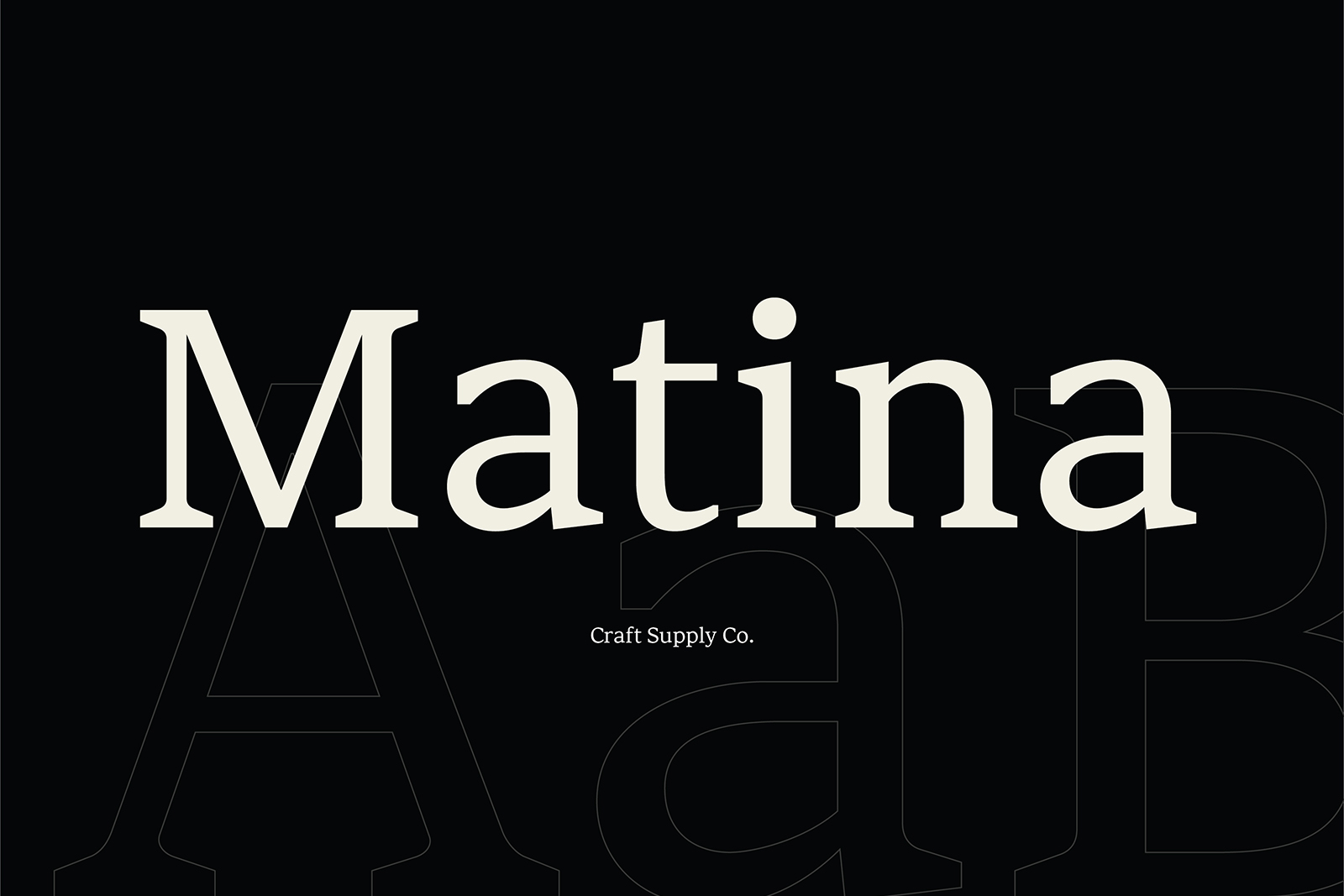
Matina Typeface offers another direction for designers looking to experiment with their typography. It can be considered for visual identity development, digital graphics, and creative editorial projects where the typeface plays an important role in the overall composition. Before selecting it, explore the product preview to understand its letterforms and personality.
3. Risley Classic Editorial Font

Risley Classic Editorial Font is worth considering for projects inspired by traditional publication design. Editorial typography often emphasizes carefully structured layouts, clear text hierarchy, and distinctive headlines. A classic editorial font can help establish this atmosphere in magazine covers, brand storytelling, posters, and printed materials.
4. Gavency Display Serif Font
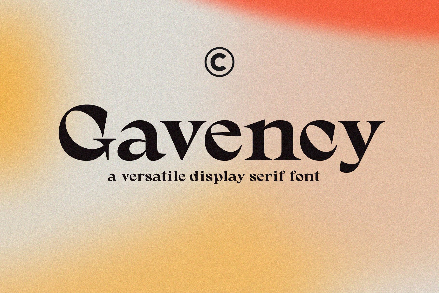
Gavency Display Serif Font is an alternative to explore when your design needs a serif typeface with a display focused role. Display serifs can help create distinctive headlines and give editorial compositions a recognizable typographic character. Consider using Gavency for magazine titles, campaign graphics, packaging, or brand presentation layouts.
5. Regarn Font Family Variable

Regarn Font Family Variable is worth exploring if you are interested in a font family designed around variable typography. Variable font technology can offer flexibility by allowing supported typographic characteristics to be adjusted within the font’s available variation axes. This can be useful when developing adaptable visual identities or experimenting with different typographic treatments.
6. CS Alyona Gothic Font

CS Alyona Gothic Font provides a Gothic inspired direction for designers who want something more distinctive than conventional editorial typography. Gothic styles can introduce a dramatic personality into posters, branding concepts, event graphics, and expressive headlines. Consider using this typeface as a focal point rather than applying it to every text element.
7. Asthetic Nostalgic Serif Font
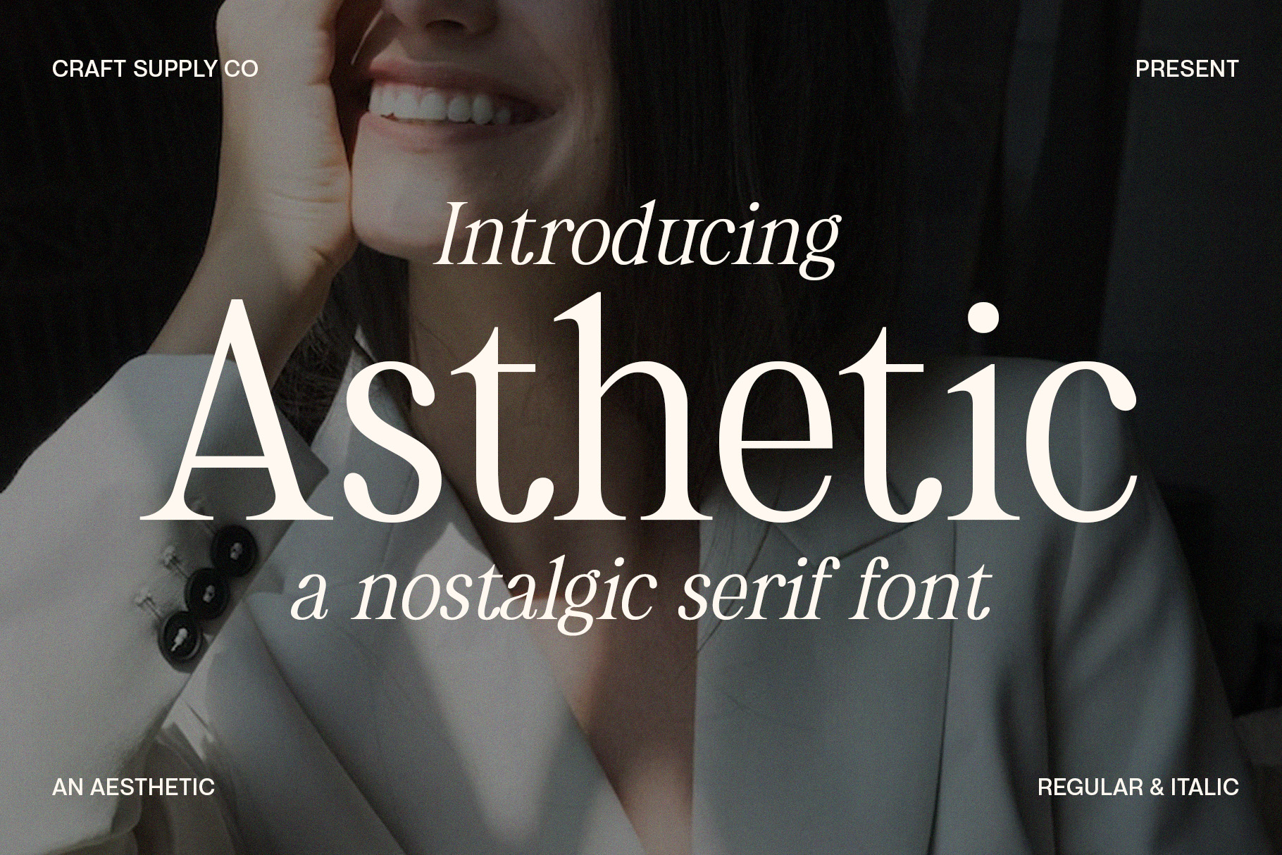
Asthetic Nostalgic Serif Font is an interesting alternative for projects that explore nostalgic visual references. Serif typography can create a sense of familiarity and bring an editorial quality to branding, packaging, and promotional designs. A nostalgic direction may work particularly well when combined with carefully selected colors, photography, and layout details.
8. Arnel Rounded Bold Rounded Sans Serif
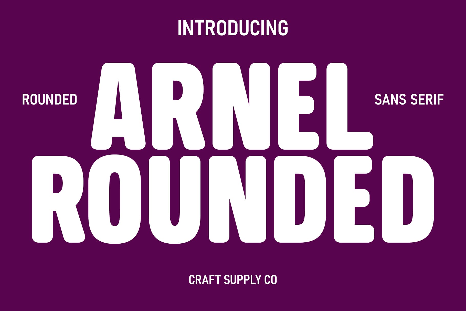
Arnel Rounded Bold Rounded Sans Serif offers a rounded sans serif direction for designs that call for a bold and approachable typographic style. Rounded lettering can create a different atmosphere from traditional sharp edged serif and Gothic fonts. Consider exploring Arnel for social media graphics, promotional materials, packaging, and digital branding.
9. Marbley Stylish Modern Serif

Marbley Stylish Modern Serif is another option to consider when developing contemporary editorial and branding concepts. Modern serif typography can introduce a refined visual quality while maintaining the familiar structure of serif lettering. Explore it for magazine layouts, visual identities, promotional materials, and headline treatments. To create a cohesive composition, combine the font with a complementary sans serif for smaller information and supporting details.
10. Audys Elegant Script Font
Audys Elegant Script Font introduces a script option to this selection of creative typefaces. Script lettering can bring a more expressive and personal quality to a design, making it worth exploring for invitations, beauty branding, packaging, signatures, and decorative headlines. Consider using Audys for short phrases or selected words where its lettering can receive enough attention.
How to Use These Fonts in Adobe Creative Applications
Once you have selected a font, the next step is to incorporate it into your design workflow. Different Adobe favorite Font applications support different creative tasks, but the basic process of choosing and formatting typography follows similar principles.
Adobe Illustrator
Illustrator is useful for creating vector based designs such as logos, typography posters, packaging graphics, and visual identities. You can use display fonts for prominent text elements, then customize the composition through alignment, spacing, color, and other design tools. For brand assets that require scalable artwork, pay attention to the final output and font licensing requirements.
Adobe Photoshop
Photoshop is useful for combining typography with photography, textures, and digital compositions. Display fonts can help establish a strong headline in social media graphics, promotional images, and creative campaign visuals. Experiment with text placement and contrast to make sure your typography remains visible against the background.
Adobe InDesign
InDesign is particularly useful for publication layouts, brochures, books, and editorial documents. When working with a font family, assign clear roles to headlines, subheadings, captions, and body text. Use consistent paragraph and character formatting to maintain a structured layout throughout the document.
Check Installation and Font Support
Before starting your project, install the font according to the provider’s instructions and confirm that your Adobe application recognizes it. If a font includes special features or variable options, check its specifications and the software version required to use them. Always review the licensing terms before distributing or publishing your finished work.
Tips for Choosing the Right Font Combination
Using one typeface throughout a design can create consistency, but combining complementary fonts can introduce more visual interest. The key is to give every font a clear purpose.
- Pair a display serif with a simple sans serif: Use the serif for headlines and the sans serif for supporting information.
- Balance decorative lettering: If your main typeface has an expressive personality, keep the secondary typography relatively understated.
- Limit the number of font families: Two or three complementary typefaces are often enough for a cohesive design.
- Establish a size hierarchy: Make the most important message visually dominant, then reduce the size of supporting information.
- Check spacing carefully: Adjust line spacing, letter spacing, and alignment to improve the overall composition.
- Test real content: Use your actual headlines and brand names when evaluating a font rather than relying only on sample lettering.
For more creative references and typography inspiration, explore design projects by Craft Supply Co. Looking at different approaches to branding, editorial layouts, and visual presentation can help you develop more thoughtful font combinations.